A Legacy Born from Utility
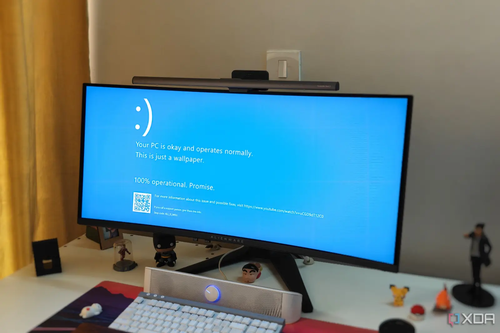
For over three decades, the Windows Blue Screen of Deathhas served as the universal symbol of computer failure. While many users assume the stark blue background and white text were a deliberate branding choice, the iconic design was actually an unplanned result of a quick decision made thirty-three years ago.
Breaking news
 Town AI Secures $108 Million Series B, Valued at $1 Billion After $55 M Pre‑Series
 Apple Prepares for Major Product Launch Event on October 28
 Apple Releases Release Candidates for watchOS, tvOS and visionOS 27.2
 Apple Limits iPhone Duo and iPhone 18 Pro Max to Reservation-Only Sales in Japan and South Korea
The aesthetic was never part of a strategic corporate vision. Instead, it emerged from the need for a simple, high-contrast interface that could display critical system errors clearly. Developers at the time prioritized functionality over visual identity, inadvertently creating one of the most recognizable, yet dreaded, images in modern technology history.
The choice of color was largely dictated by the limitations and standards of early computing environments. Blue provided a stable, legible backdrop that made white text pop, ensuring users could read error codes even during a total system crash. It was a pragmatic solution to a technical problem rather than a design-led initiative.
Could the Error Screen Have Been Different?
Because the team needed a quick way to communicate that the operating system had halted, they opted for the simplest visual path. This utilitarian approach stuck, eventually becoming an accidental hallmark of the Windows experience. What began as a temporary diagnostic tool evolved into a permanent fixture of the software.
If the development team had chosen a different color palette or font style during those early sessions, the cultural impact of the error screen might have been entirely different. The decision was made in a vacuum, with no expectation that the interface would become a global icon.
Frequently Asked Questions
The color blue eventually became synonymous with Microsoft’s error reporting. Even as operating systems have evolved to become more stable, the ghost of that original design choice remains embedded in the collective memory of millions of computer users worldwide.
Was the blue screen designed to be intimidating? No, the design was purely functional. It was intended to provide a high-contrast background that made critical error messages easy to read during a system crash.
Did the developers realize the screen would become iconic? They did not. The choice was made as a quick, practical solution during the development process and was never intended to be a long-term branding element.